DEMON TIME ENERGY
DEMON TIME ENERGY

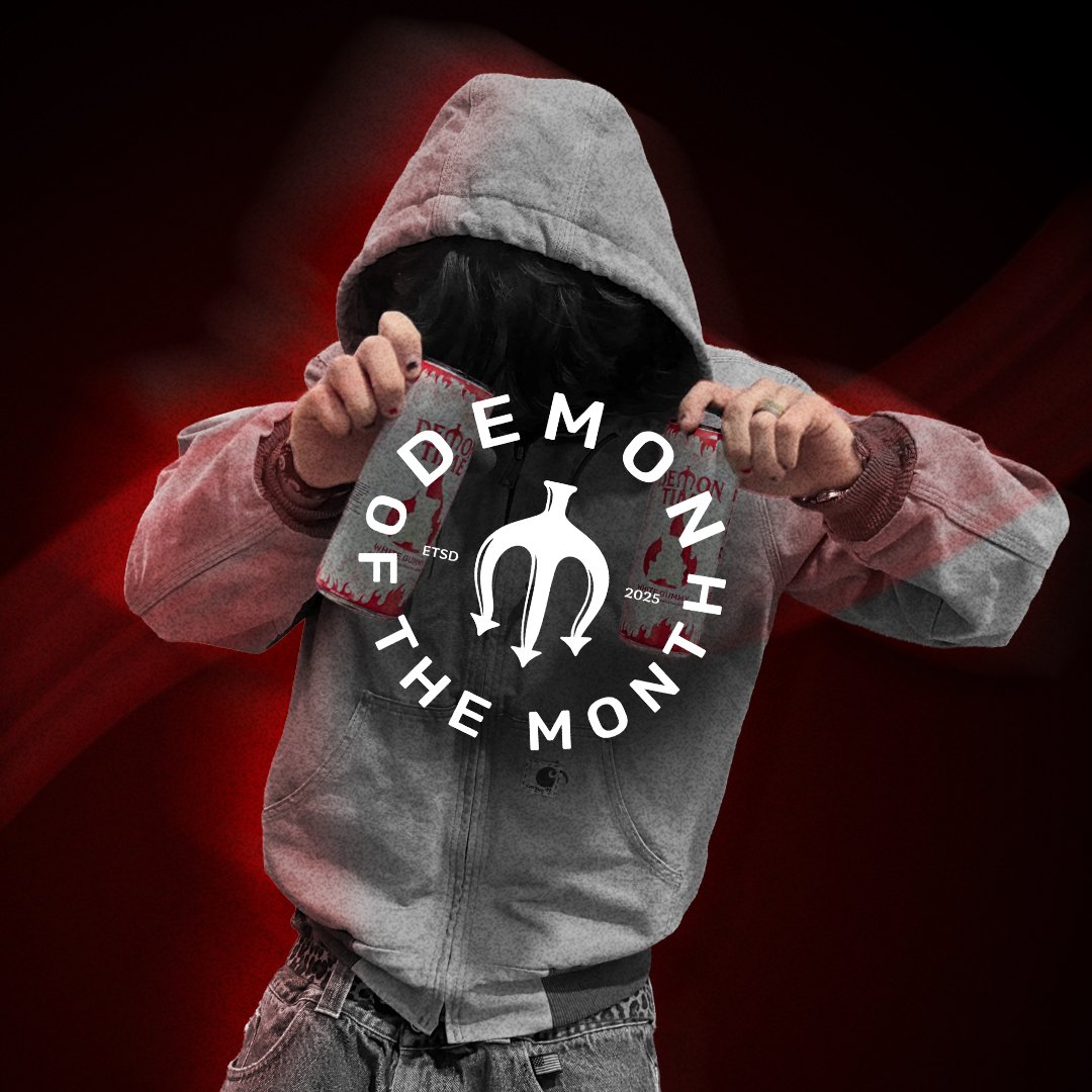
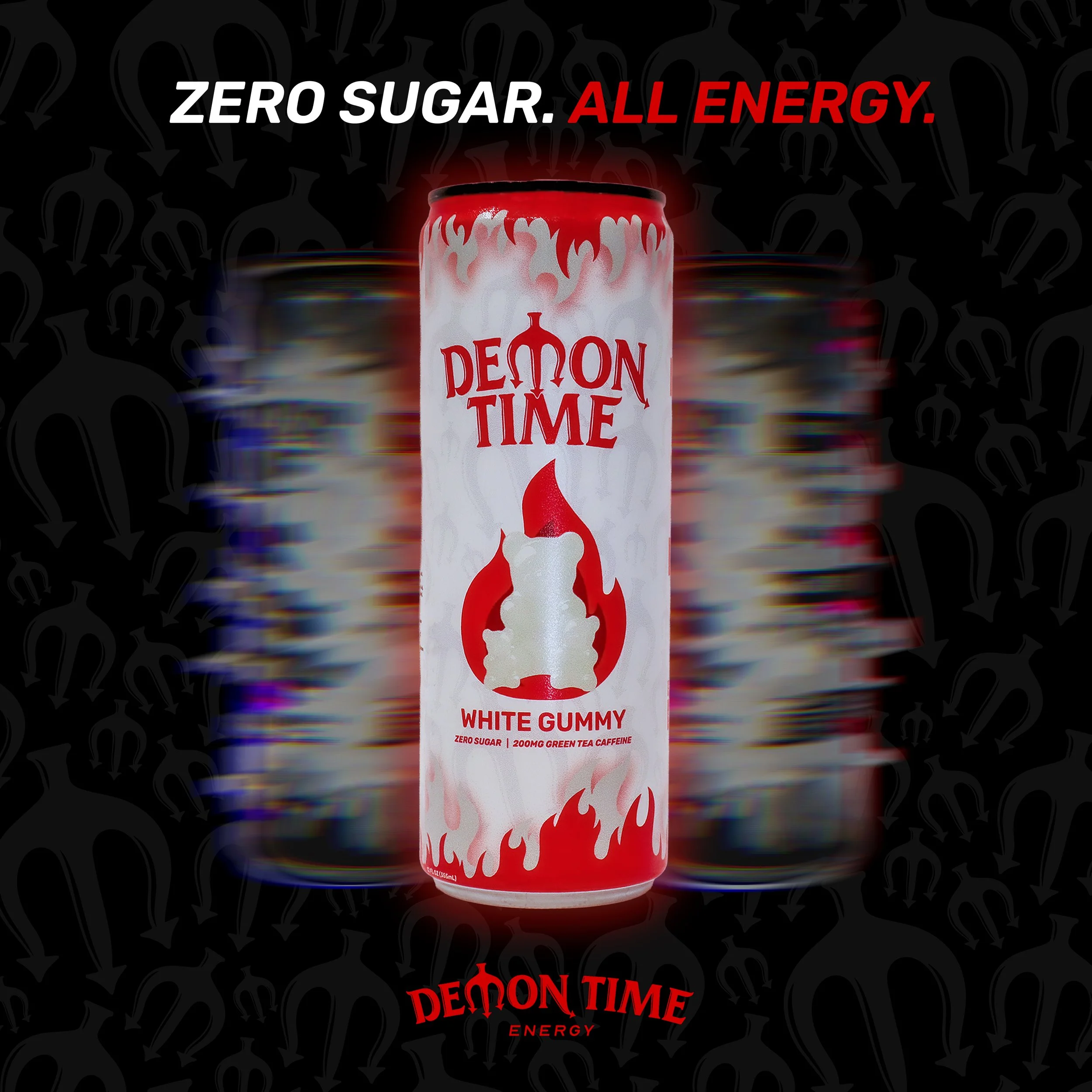
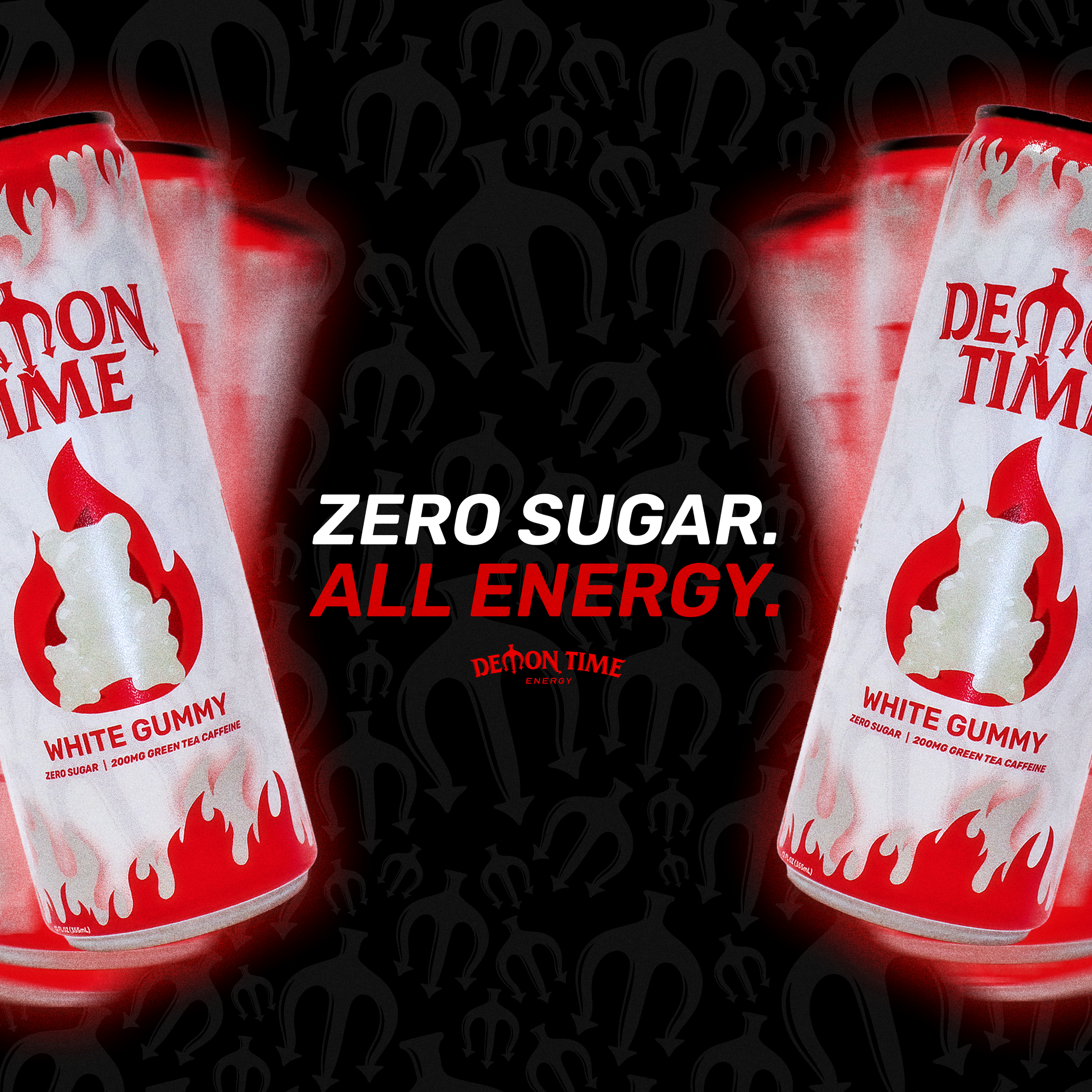
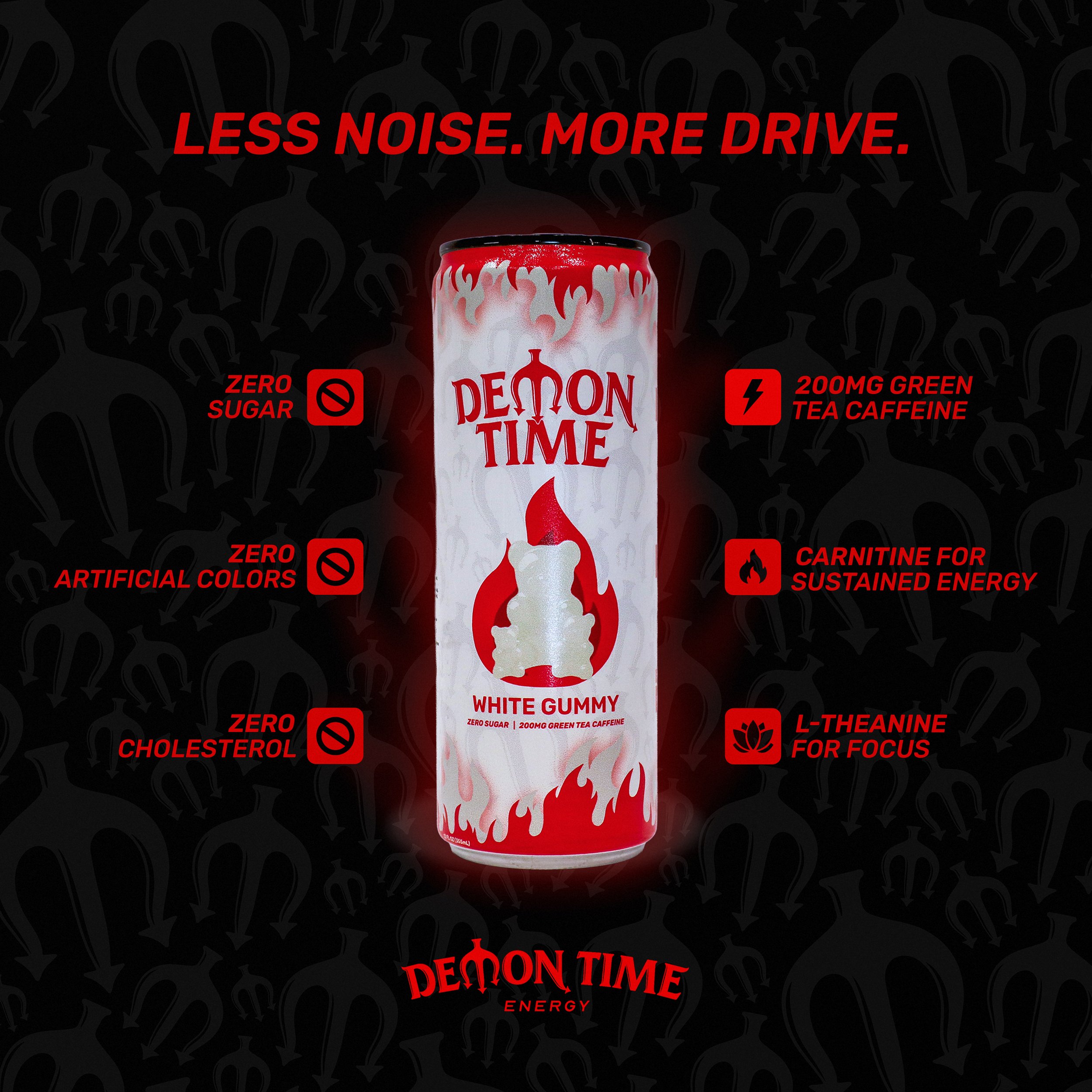
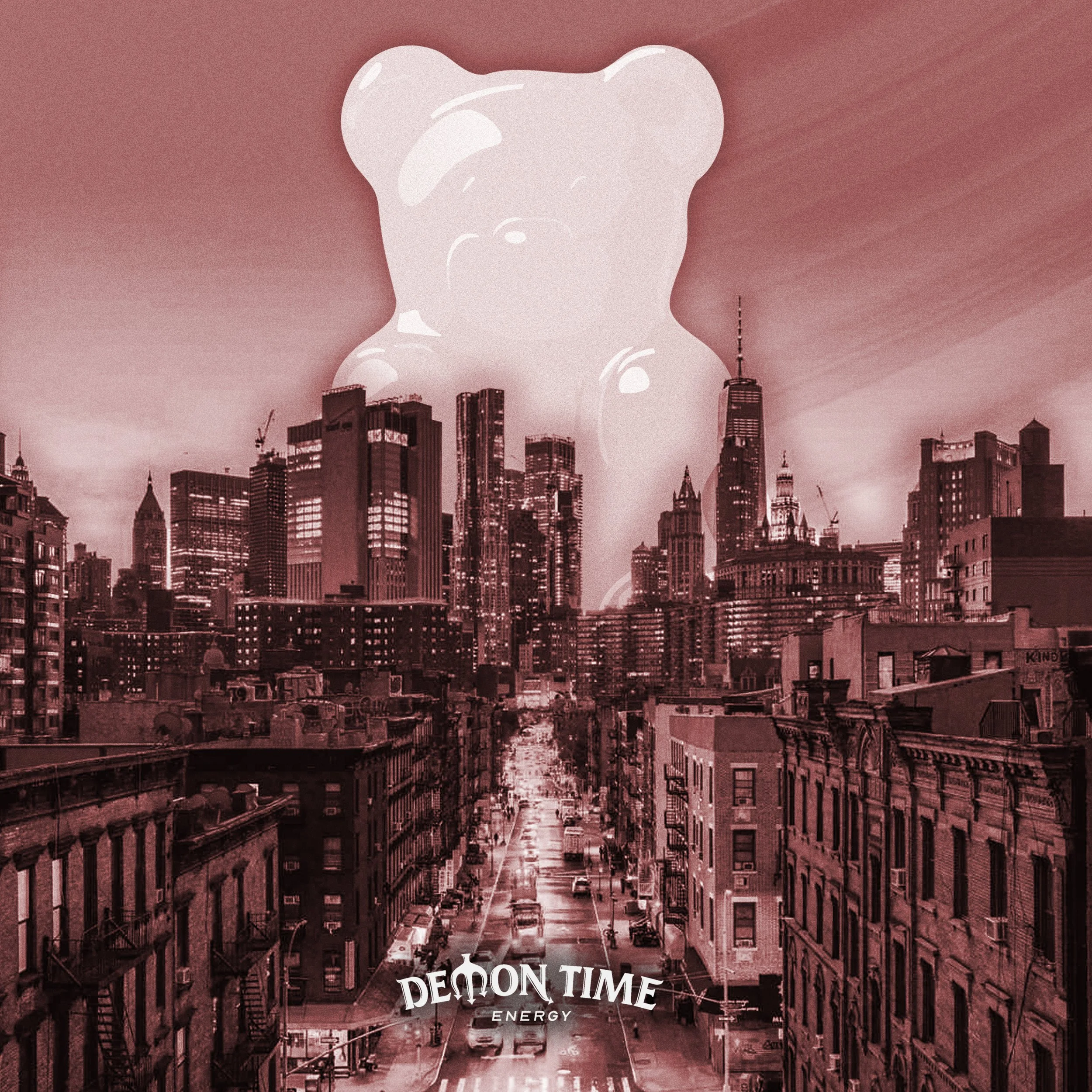
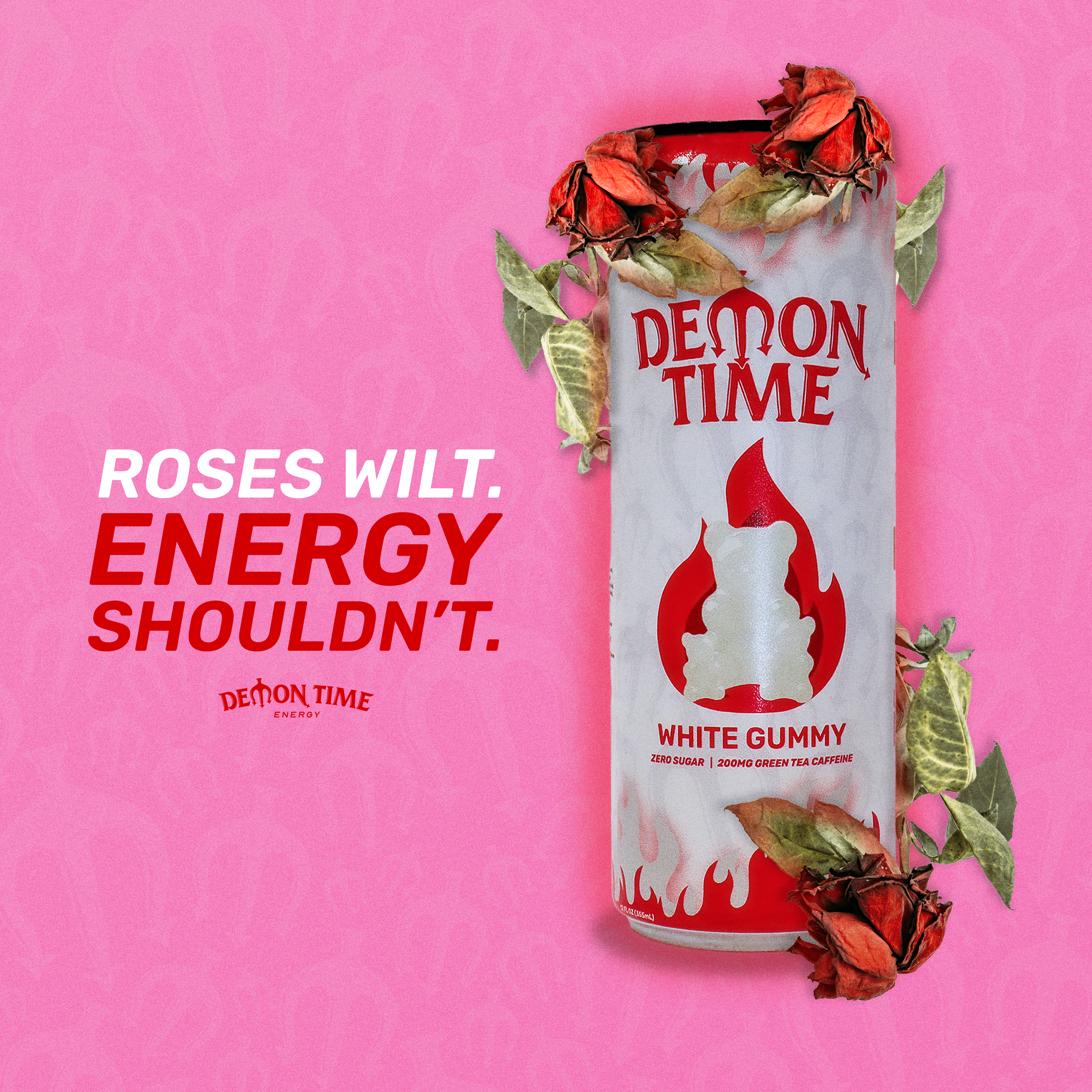
Demon Time Energy started as a blank page. No brand, no can, no name recognition, just an idea my co-founder and I believed in. I spent weeks studying the energy drink shelf, breaking down what made brands like Celsius and Ghost actually stand out versus what just blended into the noise. From there I built the visual identity from scratch. Bold typography, a flame mark that could work at the size of a thumbnail or a billboard, and a color system aggressive enough to grab attention without looking like every other can in the cooler. I pushed through dozens of packaging concepts before landing on the direction that felt right, then designed flavor-specific variations so the line could grow without losing what made it recognizable in the first place. It's the kind of project where the constraint is also the opportunity. Nobody knows your brand yet, so every design decision is the one doing the introducing.